Authors: Sydney Murray, Shanalee Shields
Date published: April 24, 2023
Welcome to the Website Connoisseur, where we take a deep dive into the vast world of cutting edge websites, analyzing every aspect to provide you with comprehensive, unbiased, and insightful evaluations. Our mission is to help you navigate the ever-changing digital landscape, and give you insight about web designs that showcase the quality expected from a modern state of the art website. From graphics and usability to responsiveness and performance, our expert team leaves no stone unturned as we introduce you the latest trends in website discoveries.

Link: https://www.bornfight.studio/studio
Client / Product / Industry
Bornfight is a digital design and product development company. They are based in the Computer and Software Industry with clients that are usually Start Up digital companies. They supply Digital Products such as Websites and Apps.
Design / Animation / Visuals
The website incorporates various creative, interactive and innovative styles, while leaving specific areas where the design is more simplified. They have achieved the purpose of showing their techniques, and making it easily usable for everyone.
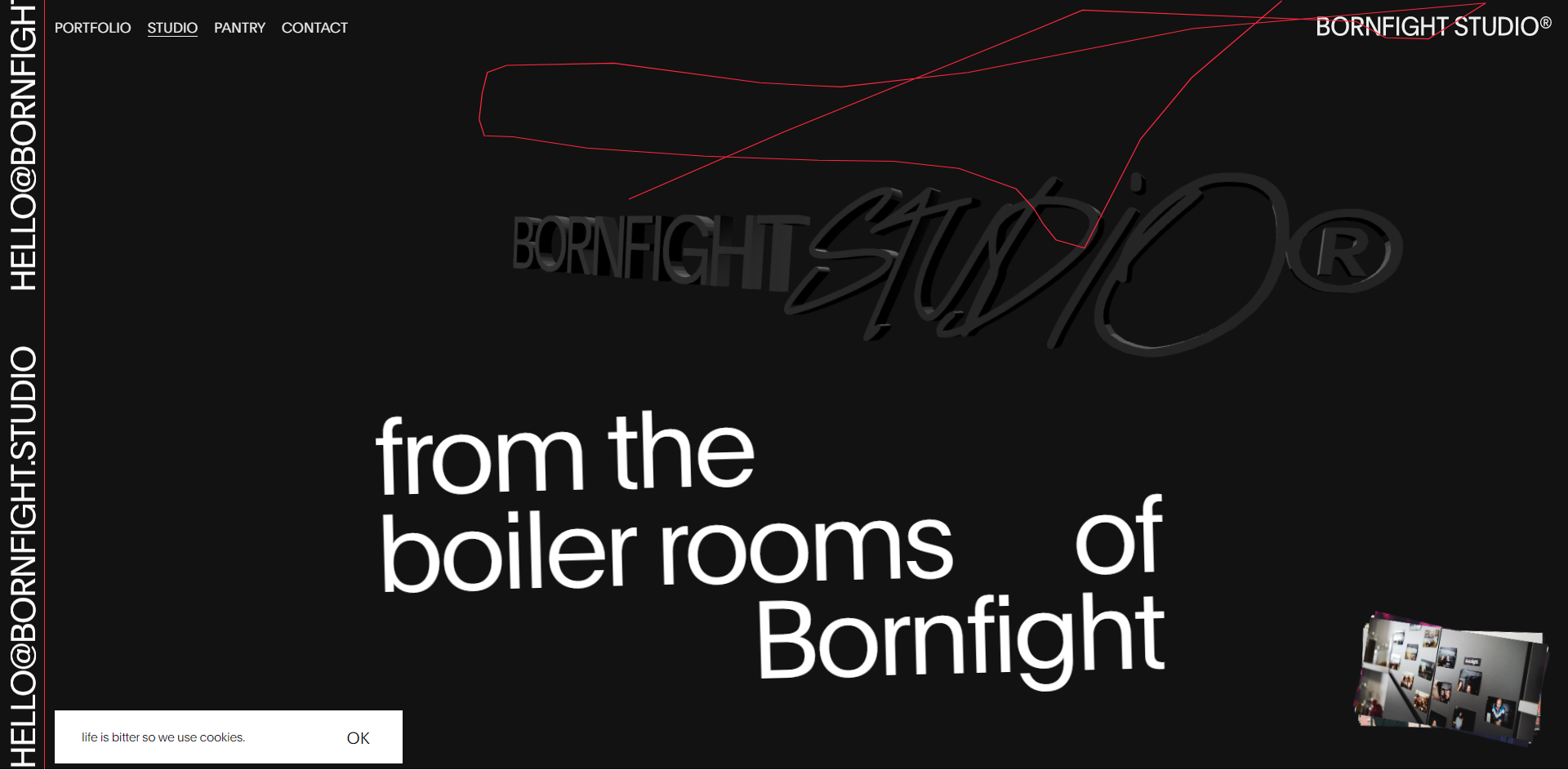
Upon opening the website, the user is greeted with the logo as the site loads, and then directed to the homepage.
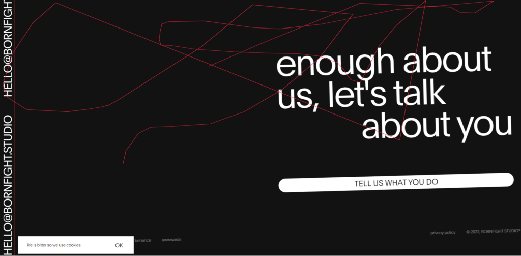
Immediately one can tell that this is a modern maximalist website, which becomes even more obvious as the content of the page is explored. The design style captivates the users attention using bold fonts, animated Gifs, 3D graphics, and interactive features, ultimately creating a one of a kind site. The interaction begins as soon as the user starts to hover over the screen, there is a red line that follows the movement of the mouse, which has no function for usability purposes but adds a touch of style and appeal to the site.
While traversing the site various quirky memes and phrases will appear, which adds more character, relatability, interest and fun to the overall website. Some parts of the site are much easier to understand than others, but it is interesting enough to drive curiosity to simply try things and see what happens.

UI / UX
In some areas the site is difficult to navigate while other areas are a bit easier. This may leave a visitor confused, or in another way intrigued.
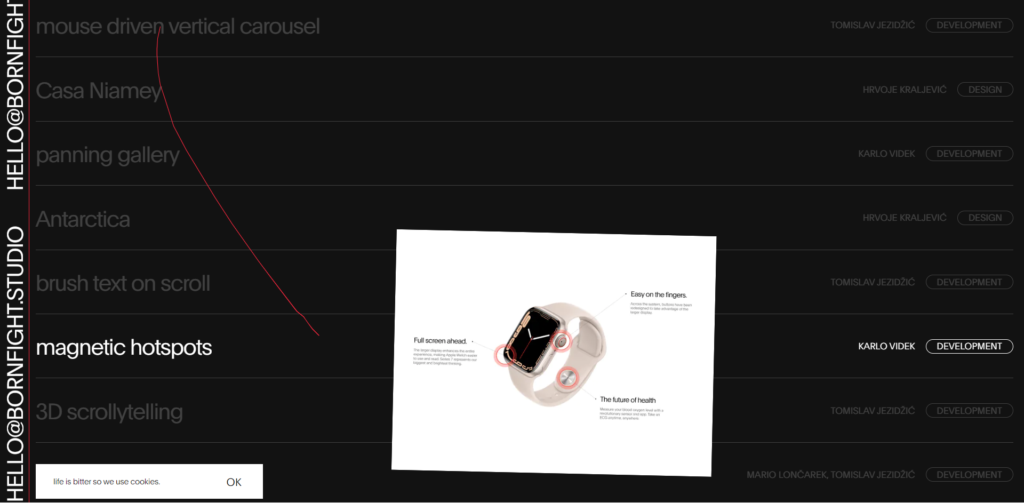
There is no obvious page or link to their blog which speaks more about what they do, which can leave users a bit confused about what they specialize in. The website mostly shows their previous work and portfolio, which is good for bringing in new clients but not for spreading awareness about the company’s specializations. There is an area on the page that allows users to even explore ideas created by developers on the team that may be useful or appealing to the clients.

Responsiveness
The site loads quickly and adapts to varying screen sizes. There are some features that are modified (like the tilted screen and the red line following the mouse), a few features are added when optimized to other devices, as well as when using a touch screen function.

Underlying technology / performance / compatibility
This site works well on different browsers, including Google Chrome, Safari, Mozilla Firefox and Microsoft edge. The red line was created using SVG and the 3d logo is made using Web GL.
Why does this website work?
It does look modern and unusual while still maintaining familiarity in some aspects, eg. font, navigation techniques and content that is often seen on media that users can relate to. It is evident that they have applied their various skillset to the creation of the site. This achieves the purpose of showing off their level of expertise and creativity in their field while still grasping the users attention. One of the most impressive aspects of Bornfight Studio’s website is its ability to tell a compelling story. The website’s content is organized into clear sections that highlight the studio’s services, projects, team members, and contact information.

While the site design is impressive, unique and quite interactive, the varying amount of styles and techniques used can be overwhelming and confusing. There is no doubt where the skill of the designers are concerned, there was a lack of balance between showing skills and creating a simplified user experience.
Overall Rating: 7/10